Thursday 25 March 2010

Virgin Red Room Ident

So the last task of the term involved making an Ident for Virgins new online music site Red Room. My first idea involved an amp cable coming out of the screen and plugging into the viewer. but the idea lacked structure so i closed the books on that one and came up with the idea of a music gremlin. running havoc on a record player. From that idea I managed to whittle down a 10 second ident idea. which involved a gremil like creature running on a record player whihc plays classical music, then starts to run which causes the music to speed up into more indie music, and since he would be running so fast he would fly off the record, hit a wall and his body would spell out Vrigin Red Room. So I started with an animatic I made in FLash.


This animatic helped me to plan out how long the music would be on for, and when to move the character. From the start I wanted to use stop motion as I have never done it 'properly' before. I bought myself an idustrial amount of plasticine and set off making my character. I started my design based off my concepts.


However, the clay man was too heavy and had to lose the arms, as well as have a skeleton made out of foil. But i was much more pleased with the final result.


So onto the stop motion! With the help of a friend and his fancy red record player, we hit the studio's common room. I first modelled the character walking, which turned out fine, however when trying to make him run, he coulsn't support his own weight and it just looked odd. so i decided to turn the speed up on the walking to making it look like hes running. we tried other shots such as a front angle but it looked odd aswell. I also photoshopped the photos to get rid of the cracks the clay make had developed and shot were my hand is holding the character up. Heres some of the photos from the shoot, as well as and angle version of the character, which we didn't use at it would have been distracting.


So I edited it all together along with the sound and effects. However I could not get it in the proper resolution, but still pleased with the final result, take a look, hope you enjoy it.


Also as a side note the band that did the music was a local band known as InColour
http://www.myspace.com/officialincolour

Live @ Five

Working as part of a team of five, consisting of myself, Luke, Nigel, Andy and Sasha, and alongside the Broadcast Journalism students, we set out to complete a set of tasks set by the Broadcast Journalism students. Luke, nominated as the team leader, met with the broadcast journalism leader, who gave him a series of tasks to be completed, each with their own deadline. These tasks included: Title Straps, Weather Map, Football Table and Surf Report. We each were assigned a task to complete. Sasha and Andy were in charge of the Title Straps, Luke was to complete the league table and surf report, and Nigel and I were set the task of the weather map. Both us of, working to a two-thirty deadline, broke the weather map down into two sections, the map and the Icons. Nigel, having more Photoshop experience than I do opted for the icons, so I set out to find a weather map. Taking a screen shot from a Free 3D Earth website that covered all of Cornwall, I started by cutting the photo out in Photoshop.

I also blurred the top of the map where Devon starts, as it was not needed and also gave the map a more professional look and changed the colour in the curves. I then went onto label the map. Looking at the script for the weather that was given to us, I made notes of what places, if any were needed and mentioned in the script. I then went onto look at the BBC weather map for suggestions.

I noticed that the map had a few key places, however it did not use symbols as we were planning. So I decided to Keep 6 key places: Falmouth, St. Ives, Penzance, St. Austell, Newquay and Bodmin.
After Nigel had completed his sequential icons for the weather map he sent them across to me, as well as some weather directions and temperature gauges. However, I found out that After Effects might not be capable of playing the icons, so I used Premier to put the icons in the right order and then play them. I then saved them and exported them into After Effects, and from there I duplicated them until they last around 30 seconds. Since I did not know how long it would take the Broadcast journalism students to do the weather, I decided to break the script down into two halves, as it appeared on the form. So I split the two halves, I animated the first half of the weather, and for the second half I used static icons, so they could cut the footage to size or hold the last frame.
A problem I encountered other than the icons sequencing, was when we transferred the images into After Effects, it cut the top off the clouds. As I wanted to get the map done for the deadline, I decided to place the rain clouds under the town names, which resolved the issue. After watching the weather in the news room I realised that since I was working so close to the screen the font seemed ok, but when watching from a normal distance I realised the font should have been bigger as well as the symbols.
Another decision I made was not to include all the symbols Nigel had made, for instance the weather sock, it would have been a great feature if the map was going to be used full screen but since the presenter was going to be on the other side it would have made the map cluttered. Also, on the weather script, it gave a wind direction for the first day, but no direction for the second day, so I decided to include the temperature symbol Nigel made instead.
Finally I rendered the map to the correct resolution and ratio and gave it to the Broadcast Journalism student in time for the deadline set.
Since we all had finished early, except for a few 'disappointing' changes that had to be made to the title straps, such as making them static, because the Broadcast journalism students ran out of time. We were given some tasks to complete for World Today. My task was to simply place two pictures side by side in Photoshop, and make them fit, be clear and be the right resolution for widescreen television.
Overall I really enjoyed the day. It gave us the sense of working to deadlines on the day we are given the tasks. as well as working as a team and tackling a problem. Since we didn't know Live @ Five's house style we all decided to work to our own blue house style. One part in particular I liked was even though we were set our own tasks, we still bounced ideas off one another, tried different backgrounds etc, and ultimately made decisions as a team.

A Room Fit For A King.

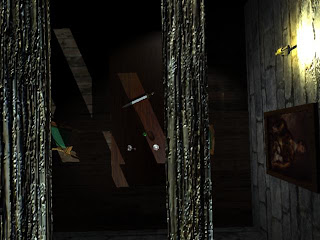
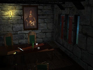
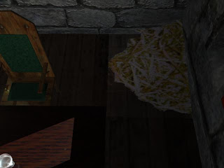
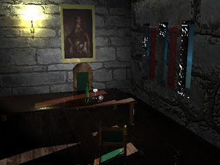
Our latest Maya task was to create a room, fully lit and with 1 main light source IE door, fire, window. I attempted to create a medieval room, with the main light coming from the windows, 3 in total. The light would cascade down onto the table and reflect off glasses. I wanted to create an eerie feel to the room, so I modelled a tipped over chair and spilled wine glass and later added a sword and coins. So to start I created a 3 surfaces, 1 floor and two walls. For the wall with the widows, I had to add vertex's and faces and delete some as well. I the assigned a Blinn and added a stone texture online, I then bump mapped this image to give the wall some texture. after modelling the table and chairs, I went to the glasses, which were revolved CV Curves with a high opacity blinn. The objects didn't have refraction but still gave off shadows representative of the object. After the base of room had been made, I went about adding details such as a candle, picture, sword, coins and some hay. I then went around to make sure all were in the correct scale, textured properly and lit. I had around 15 lights in my scene the candle had around 4 just to light it. finally I organised my objects and deleted their history. Out of all the projects this was the one I want try again, because I enjoyed it and felt I could create some better rooms. This project has also prompted me to collect some of my own texture photos. Since the ones online were either out of resolution or just not right. But I really liked the project and hope to create more rooms. Heres some renders, the first one is of and above view of the room to show off the beams, which gave the room a sense of height. The second screen is my final one and is of the cameras position and the perspective I was lighting from, the rest are progression screen to show of the stages.


A Day At The Vets.

So after reading the flash brief through and choosing around 40 seconds of speech, I noticed that I would only need 2 out of the 5 characters I made, which was dissapointing conisdering I made the mouths for them all. It took me a while to scroll through the sound, and edit the voices in Soundbooth, since some voiced were quieter than others, and also there was alot of filler, and pauses. The main trouble I had with the lip sync was the voices spoke very fast, and also used sounds like "um" and "ah" which ment I had to decide what mouths to use, such as two mouths in succession, or just one open mouth. I made the characters blink and move thier eyes, I would have liked to have animated them more. perhaps but movement in the background, or something that would make the scene more appealing, but overall I really enjoyed using Flash. It was tidious having to go back and forth just dragging mouths over, but its possible to get a clear and crisp animation. So heres the clip.